— C&G Carpentry
An effective identity for an experienced carpentry company.
-
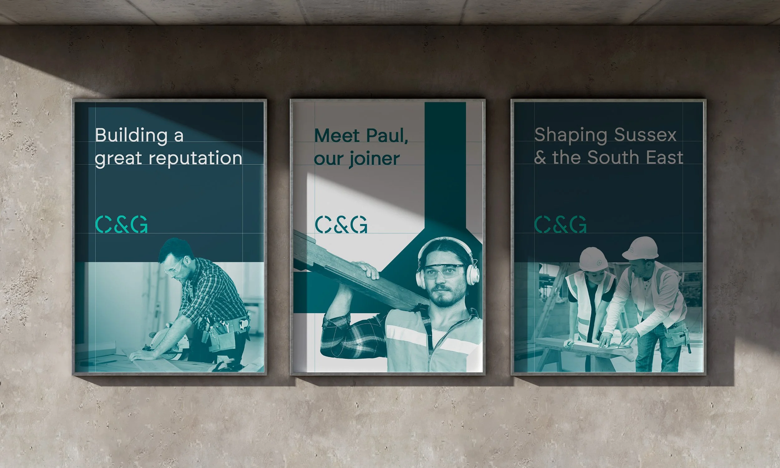
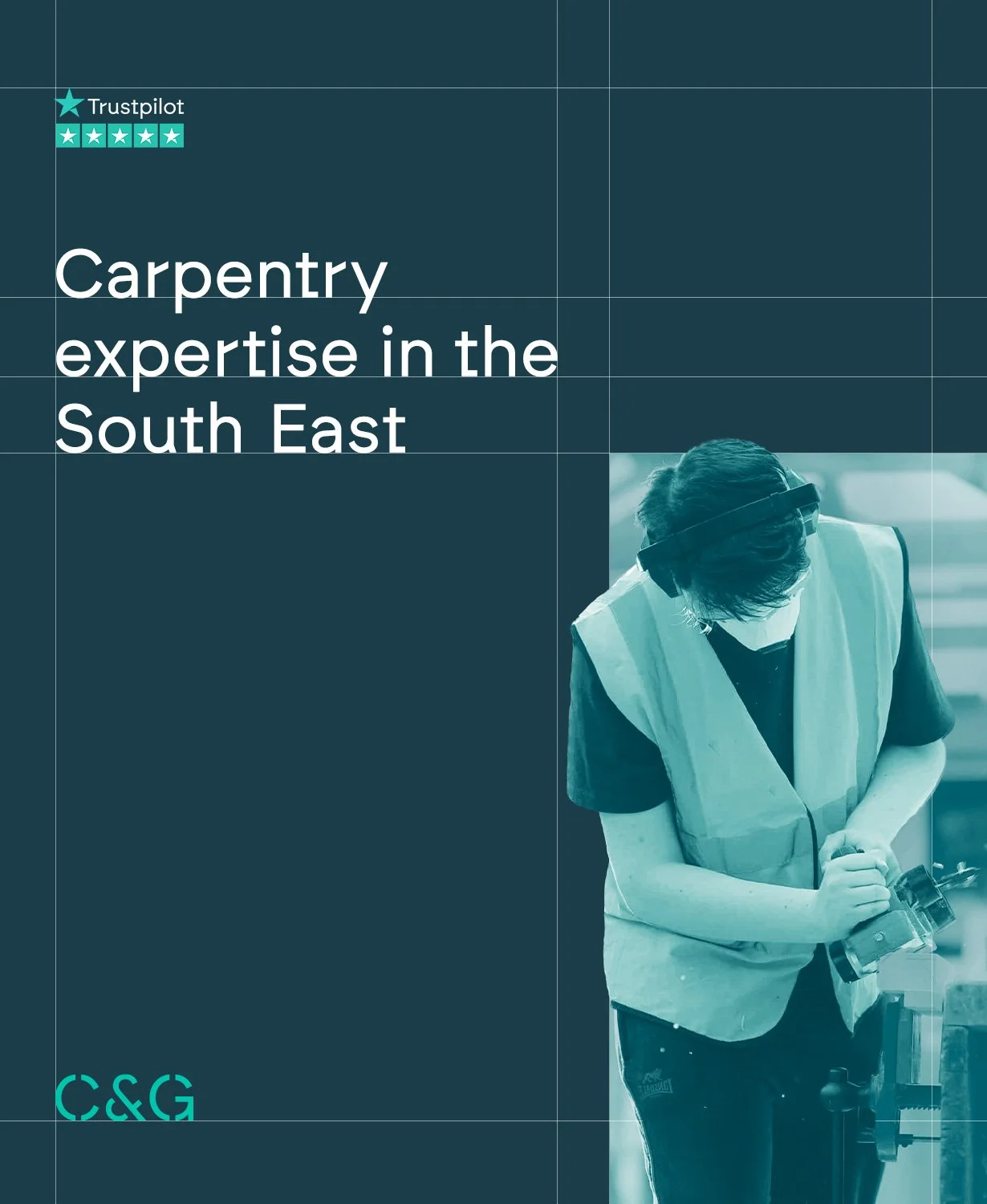
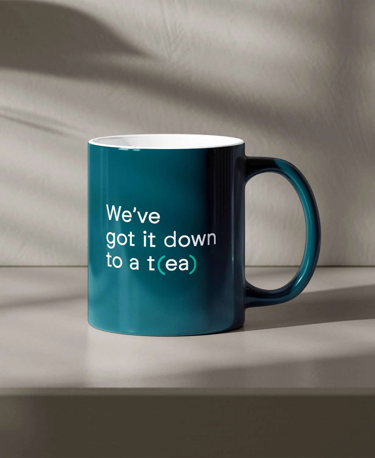
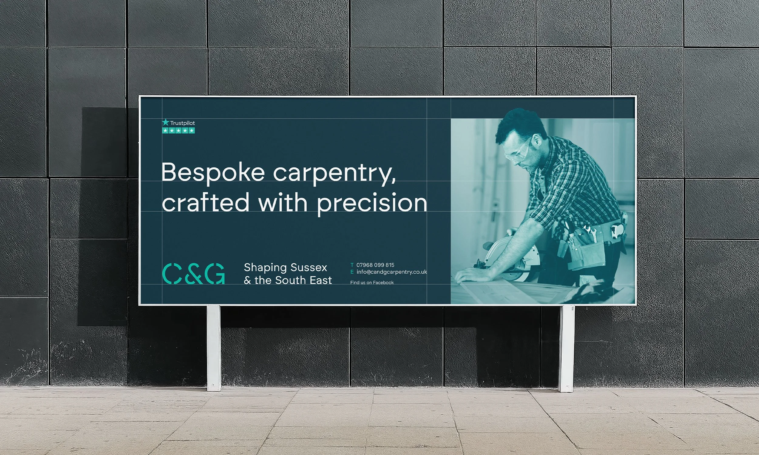
C&G Carpentry are a Sussex based carpentry company who pride themselves on their eye for detail and accuracy. I was approached by Neil, the owner, asking for an identity that would encapsulate his company’s vision of efficiency and accuracy while being instantly recognisable. The solution also needed to be legible when small as he had plans to utilise the identity across various items of branded workwear for his team.
-
After initial concepts focusing on blending the C and G together into a unique icon, I discovered that we could add a layer of relevance by creating a screw head from the two letters. The font ‘Brockmann’ was tweaked and adapted to become a stencil for the logo, adding to the feeling of craftsmanship and industry.

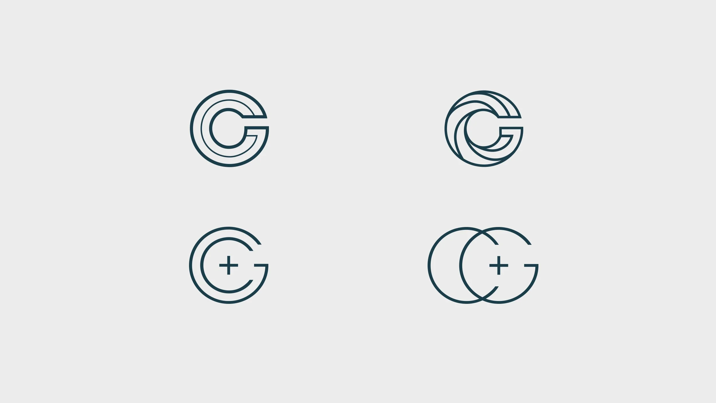
Some early icon concepts linking the C and the G.

The chosen icon, referencing a screw head.

Icon with lettering.

The typeface used - Brockmann Regular by Atipo Foundry - has been edited to reference a stencil.

Brockmann Regular.

Brand colours.



“Love it. Tom understood exactly what we had in mind. Highly recommended.”
Neil Baughan, Owner